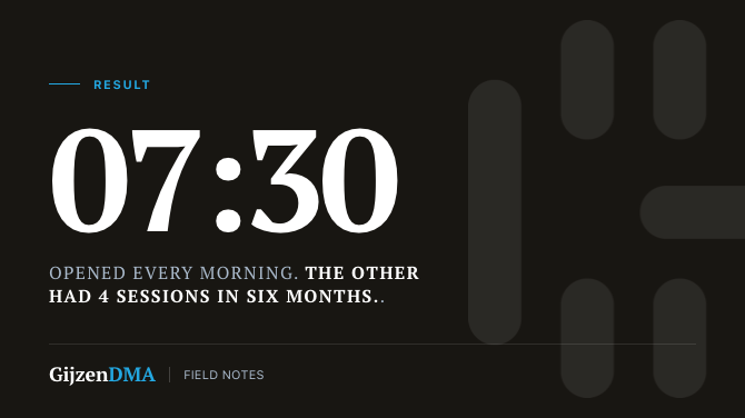
A logistics client had two dashboards running in the same system. The first got opened every morning at 07:30 by the entire operations team — before the first coffee. The second had logged four sessions in six months, all four from the person who built it.
Same platform, same team, same data. One dashboard that works, one that effectively does not exist.
It is not about the quality of the visualisation
That is the first thing people assume: the unused dashboard must have been uglier, or harder to understand. Rarely. In this case it was technically the more polished of the two.
The difference comes down to a simple question: at what moment in the day does someone need this, and what will they do with the answer?
The 07:30 dashboard answered one question: is today going to work? Load status, exceptions, deviations from plan. The driver who is late, the shipment that did not leave yesterday. Five numbers, one colour per status. No drills, no filters, no time selection. Open, read, decide.
The other dashboard answered a question nobody was asking at the moment it was built. Good trend analysis — quarterly comparisons, regional breakdown, historical benchmark. Useful for a quarterly review. Not useful on a Tuesday at 07:30 when the schedule is running twenty minutes late.
Built for the requester, not the user
This is the most common mistake in dashboard projects: the dashboard gets built for the person who requested it, not for the person who uses it daily.
The requester wants completeness. He wants everything in there, in case someone ever asks. He thinks in terms of accountability, not usage. And because he is the one who calls you when it is done, you build it for him.
The daily user wants one question answered, at the moment it matters. He does not want to filter. He does not want to navigate. He opens it, sees the answer, and moves on.
Those two are incompatible. If you try to put them in the same screen, you lose both.
What pre-build conversations need to surface
We ask three questions before drawing a single visual on any dashboard project:
Who opens this, and when? Not “who has access” — who actually opens it, at what time of day, on what device. A warehouse manager on a tablet at 06:45 is a different design problem than a CFO on a laptop on a Friday afternoon.
What is the first action after looking at the dashboard? If the answer is “then I send an email,” you are building something wrong. A good operational dashboard either triggers an action or confirms that no action is needed. That is all.
What is the threshold for “something is wrong here”? Users need to tell at a glance whether the dashboard has refreshed itself. If they cannot, they do not trust it — and then they stop opening it.
Adoption is designed in, not added afterwards
The 07:30 dashboard did not become popular because it was better. It became popular because it was built into the daily rhythm of the team. The question it answers existed before we arrived — every morning someone would manually check three systems at the planning board. We replaced that conversation, we did not invent it.
The other dashboard had no rhythm. There was no moment when anyone was asking that question. It was useful in theory. Theory is not a habit.
Adoption is not a communication strategy you run after go-live. It lives in the question you answer, at the moment that question is alive. If you cannot identify that moment in the first conversation, the dashboard is not ready to be built yet.
This is a pattern we see in almost every reporting engagement. The technical side is rarely the problem — the conversation before the build, almost always.